International conference organised by Università degli Studi di Padova, Université de Lille, Istituto per il Teatro e il Melodramma – Fondazione Giorgio Cini, Venice, 15–17 January 2020. The conference is part of the Lumière de Spectacle project.
Colour takes up space: Abstract
Colour takes up space is a project born in 2017 from the encounter between the choreographic research of Marco Valerio Amico and gruppo nanou, centred on the complex relations between body, space and light, and the visual research of Daniele Torcellini, devoted to emphasising the perceptual instability of colour. Already engaged in redefining choreographic processes through an analytical approach to its own working method, gruppo nanou continues its work on spatiality by articulating, together with Daniele Torcellini, spare sets of minimalist character with echoes of Neoplasticism: surfaces coloured in the three primary colours, oriented along the three Cartesian directions, lit by shifting LED lights. Changes in the colour of the illuminating lights and in the intensity of the beams generate an unstable space, in continuous transformation, following the inconstancy of the surfaces’ perceived colour; with this space the choreutic action enters into a relation that is itself unstable and continuously rewritten by the performers. Colour — in its inextricable relationship with light and with the observer, whether the colour of the surfaces and of the bodies on stage or the colour of the overall environmental space — stripped of any symbolic, conceptual or iconographic value, comes into play as an instrument with which to modulate space over time. To date, the project has taken shape in various solutions, more or less hybrid, between stage performance (as in We want Miles, in a silent way) and performance/installation freely experienced by the audience in terms of the duration of the experience and the choice of viewpoint (as in Neverwhere).
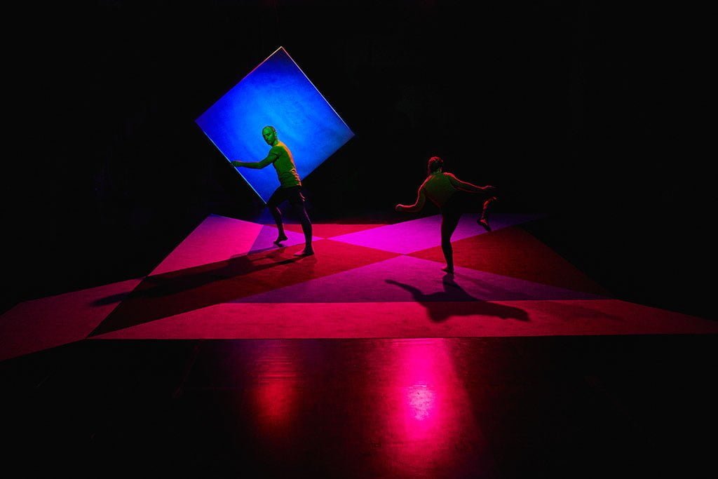


Color takes up space – © Daniele Casadio
Colour takes up space Technical premise
The complex human visual system, made up of eyes, optic nerves and cerebral visual areas, affords us an intense and satisfying experience of colour. Although colour has no existence in itself outside the mind of an observer, we are naturally led to consider colour as belonging to the things we look at. Colour, in the most habitual way of perceiving it, appears to us as a property of the surfaces or of the volume of the things we look at. The colour of a carpet, or the colour of a glass of white wine. Great fascination, however, attaches to all those chromatic phenomena in which this sensation falls away for some reason. The colour of a sunset, as it unfolds, lies in the near-ineffability of the environmental space surrounding us rather than in any specific surface. In the same way, if with even greater emphasis, we appreciate those manifestations of iridescence in which what we look at presents no single stable colour but almost the entire chromatic spectrum, shifting according to our point of view, as with the colour of soap bubbles or of the plumage of certain birds. Shifting colour draws our gaze, as though it were a colour more intimately close to the deepest nature of colour itself.
And then, in the scroll of social network feeds, there erupt those images which, as if to rouse us from a state of torpor, compel us to abandon at least for a moment the position that scholars of the psychology of perception call that of the naive realist: the person who believes that the world is exactly as it appears to us and that there is a perfect correspondence between physical phenomenon and phenomenology. A position we all assume in daily life, partly because our perceptual system has evolved so as to let us move and act in the world with an effective mental, interior representation of it, one that keeps us from doubting the partiality of our impressions. This, however, is not the case, and the example of the photograph of a dress that went viral on the web — seen by some as striped in horizontal blue and black, by others in white and gold — opened a particularly significant breach. The audience of observers split in two, each half incredulous that the other could have so different an experience of the same image and, precisely for this reason, forced to reckon with the ambiguous relationship between the world outside us and our perception of it. And this is because one of the most pervasive characteristics of our visual system is so-called colour constancy: the phenomenon whereby the colour of an object’s surface appears to us almost always the same, even as the light illuminating it varies. Edwin Land, founder of Polaroid and also a tireless student of visual perception, was among the first to account for colour constancy, hypothesising a model of the functioning of the human visual system, called Retinex, according to which we perceive the colour of an area in relation to the colour of the areas surrounding it and not in absolute terms, as though we were a scanner measuring, for that area, the intensity values of the wavelengths it reflects. The Retinex model was subsequently verified by the neurobiologist Semir Zeki, who identified a portion of our brain charged with carrying out comparisons of this kind — although before him, adopting an experimental rather than theoretically systematic approach, as an artist, Josef Albers had already addressed the question, studying the interactions of colours with one another. And so, although the quality of the illuminating light — in terms of the distribution and intensity of the electromagnetic waves of the visible spectrum — changes at different moments of the day, or according to the type of light source illuminating us (the sun, a candle, a fluorescent lamp, tungsten filament, halogen, LED and so on), we see the colours of the world outside us as constant and not fluctuating, as instead is the spectrum of wavelengths they emit from case to case. There is, however, the other side of the coin. And to colour constancy there corresponds colour inconstancy: the phenomenon whereby the appearance of a colour changes as the light illuminating it varies. The project Colore? was born with the idea of emphasising this instability of colour, selecting and printing a given chromatic range on paper and then lighting the prints with shifting-colour LED lamps. The aim of the project is to place the observer in a position to see a surface that is materially quite identifiable as paper, whose colours change over time so as to produce a change in the space of the surface as well, in a manner not unlike the way we are used to seeing the colours of a video monitor or a video projection change.
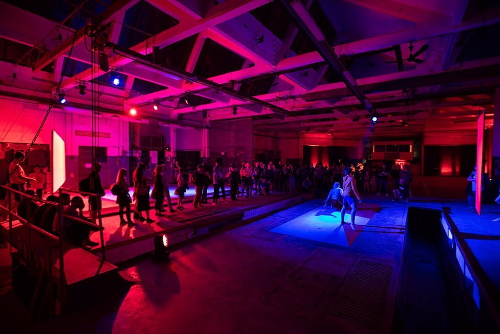
Color takes up space – © Gianluca Naphtalina Camporesi – Dancers: Sissj Bassani, Rhuena Bracci
Colour takes up space: The encounter
In September 2017, invited by Daniele to visit Colore?, the installation of printed colours lit by shifting lights, set up in the evocative setting of the Antico Convento di San Francesco in Bagnacavallo, near Ravenna, curated by MAGMA, Marco sensed how important the lighting-and-colour device employed there could be for the evolution of a choreographic process based on the definition and construction of dynamic spaces.
In gruppo nanou’s choreography, space is almost always the nodal point from which projects are built. Space is understood both as the place in which the action unfolds and as the action that determines the perception of a spatiality. A body in the desert acts differently from a body in a room, just as a gaze in the desert is positioned differently from a gaze in an enclosed place. It is therefore interesting to determine how an action in the desert might be transposed into a room, or vice versa, with the aim of producing a perceptual defamiliarisation. This is not a question of imagination or suggestion; it is a problem of sensory perception.
Light, in the way it has always been used in gruppo nanou’s work, is a spatial instrument. From the earliest works, the group and the lighting designer Fabio Sajiz, with whom they collaborate, noticed that what matters is not what to show with light but what to conceal, in order to probe the image-making possibilities of darkness. Physical space and light, as space, collaborate with physical action in determining time and in constructing rhythm. Rhythm is understood not as a pattern repeated over time but as a punctuation of time within time.
That spatial instability, perceptually experienceable through the relationship between light, colour and surfaces, on which Daniele was working, opens up gruppo nanou’s research path, with renewed enthusiasm, towards a territory still under exploration, with the as yet unfulfilled aim of drawing exactness and effectiveness of artistic result from the complexity that the device — enriched by the variable of performative action — is able to generate.
After more than two years of work that, in the authors’ intentions, is set to continue, Marco puts forward what he calls a brief guide to colour in choreography. In spare, apodictic language, though not without a veil of irony, deliberately imperative rules are set out to establish limits that might make the creative accident possible: the error that, in a balance itself unstable between hyperdeterminism and randomness, has so far always allowed gruppo nanou to identify the unforeseen occurrences necessary to move towards new curiosities.


We want Miles, in a silent way – © Michela Di Savino
Colour and choreography – Rules of the game
- Colour is space.
- Colour exists only in the mind of the observer.
- Colour is abstract.
- Colour is drama. So is the body. So is sound.
- Colour, in the same way that decoration intensifies surfaces, intensifies space.
- Do not use colour, or the body, or sound, to dramatise. Doing so is needlessly redundant.
- The use of colour is necessary if it is spatial.
- Determine the difference between the rhythm dictated by chromatic change and the rhythm produced by the switching on and off of light sources. The variation in luminous intensity is to be understood as a further parameter of analysis and information.
- The relationship between colours in a polychrome environment must be vibrant in order to sustain the alteration of perception. Refer to Andy Warhol’s screenprints only as a first, superficial example. Then move on to James Turrell, Sol LeWitt, Olafur Eliasson, Dan Flavin, Nicolas Winding Refn and others, not necessarily in that order.
- The relationship between colours is determined by the change in the colour of the light source: if the space is altered by the chromatic change, the relationship is correct. By space, the body is also understood.
- The body becomes polychrome by departing from reality, the emphasis of a hyper-real matter.
- Polychrome colour on the body must reach the figural, in collaboration with the choreographic writing that determines the chromatic territory of the action so as to decompose the dancer’s surface. The figure isolates itself and turns into fact, escaping illustration.
- In relating to colour, the body enters a dimension of detail while retaining its maximum amplitude, since it collaborates in the instability of space, together with the other languages of the stage.
- Sets must be chosen for their ability to respond to colour.
- Space is articulated by following geometric coordinates, so that the sets take part in determining territories, trajectories, lines of flight and concealments. The same applies to light, since it is used to reveal and disclose spaces.
- If, when the colour changes, the stage objects retain their identity, they are wrong. Look for others.
- Costumes are understood as surfaces responding to colour, in support of the use of the choreutic body, on a par with the sets in defining the space of the choreographic action.
- Costumes must be chosen for their ability to respond to colour, thereby determining a paradigm of correspondence.
- If, when the colour changes, the stage costumes retain their identity, they are wrong. Look for others.
- Work on colour is work on perception. Worth repeating.
- To achieve a perceptually effective space, the possibility of immersing oneself in that space is required. There is no longer a single point of view but a single space shared between the choreographic action and the observer’s gaze. Take as reference spaces such as electronic music clubs, museums, dark rooms, labyrinths, Bruce Nauman’s corridors.
- Choreography takes on the task of being gaze.
- The audience’s gaze takes on the task of being object of/in space.
- The body, the set, sound, light, colour and the gaze collaborate in the choreographic construction, which is the perfect relational equilibrium that allows each element to find its exact compositional placement.
- Space is mobile and in continuous transformation. The dancer’s body, sound, light, colour and choreographic activity work inexorably so that the coordinates of the gaze are continuously held taut towards a variation in progress.
- The spectator’s gaze must be continuously solicited so that it can come to rest only if it takes on an attitude of search, one that allows and impels it to shift the body and become weight for the rewriting of space.
- The choreographic project has meaning only if the entire procedure reaches a degree of epidermal vibration.
- The choreography rises because it generates and reveals space.
- At the entrance to the space, a working bar must be installed.

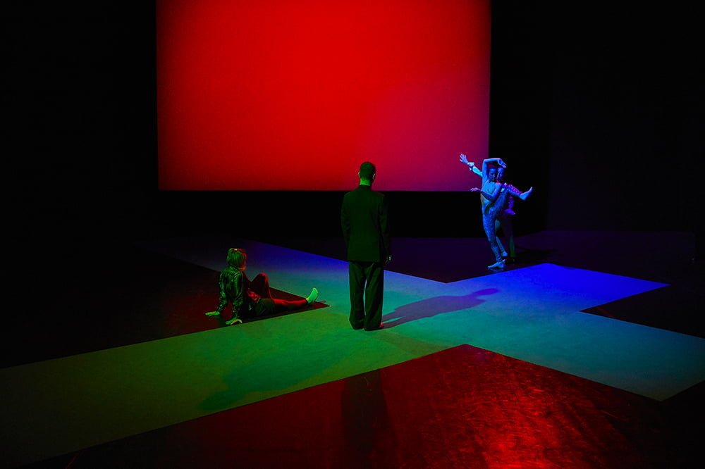

We want Miles, in a silent way – © Daniele Casadio
Colour takes up space: Partial conclusions
In the light of over two years of experimentation, a number of insights of a polar kind have emerged. The mapping of unstable space is to be understood within the relationship between two-dimensionality and three-dimensionality. Two-dimensionality of the horizontal and vertical surfaces, three-dimensionality of the enacted volume. Light, space, colour, bodies, choreutic actions, observers define unstable spaces whose volumetry is emphasised or reduced in relation to the contrasts or analogies between shifting lights and the appearance of the colours on stage. The sequences and combinations of the colours of the lights may follow criteria that limit authorial input, in relation both to the deterministic necessities of colour theory and to aleatory strategies. Modernist space — made abstract by monochrome surfaces in the primary colours, minimalist in cut, oriented along the Cartesian directions — contrasts positively with the postmodern presence of bodies dressed in real-world clothing.
To date, the experimentation continues.
Public presentations
We want Miles, in a silent way, November 3 2019, Danae Festival / Teatro Out-Off, Milano
Neverwhere [prototipo]: habitat per luci, corpi e occhi, October 31 2019, Mar – Museo d’Arte della Città, Ravenna
We want Miles, in a silent way, June 26 2019, Teatro Alighieri / Ravenna Festival, Ravenna
Alphabet: color takes up space / workshop, June 11-13 2019, EXATR / Ipercorpo, Forlì
We want Miles, in a silent way April 26-28 2019, La Mama Moves Dance Festival, New York City
Neverwhere [prototype]: habitat for lights, bodies and eyes, October 19–20 2018, Fèsta / Ardis Hall, Ravenna
Colour takes up space / Alphabet: a writing project for a possible dance, August 5 2018, Artcity / Museo Archeologico dell’Agro Falisco, Civita Castellana (VT)
Colour takes up space / Alphabet: a writing project for a possible dance, May 24–25, 2018, EXATR / Ipercorpo, Forlì
Colour takes up space / Experiment, February 16–17, 2018, Ardis Hall, Ravenna
Colour takes up space, December 2–3, 2017, Fèsta / Ardis Hall, Ravenna


